Step 17: Mobile SEO and UX Optimization

Photo by Luke Wroblewski (CC BY 2.0), modified
Mobile is the No. 1 priority for SEOs today. Here’s why …
First, mobile internet usage exceeds desktop. People using smartphones make up more than half the consumer traffic to top sites globally.
Second, more searches take place on smartphones than on desktop computers, according to Google.
As a result, satisfying mobile users is the search engines’ top priority. It’s no wonder they look closely at how your site treats its mobile visitors before giving you a high ranking.
Mobile SEO is crucial not just because smartphone users are the majority, but also because Google and Bing use mobile-friendliness as a ranking signal in mobile search. In fact, Google is even switching to a “mobile-first index” — which means the mobile version of your site is what counts for ranking purposes.
Is your site’s mobile SEO everything it needs to be? In this lesson, you learn how to:
- Optimize your website to be found in mobile search.
- See how many mobile visitors you have today.
- Pick between 3 ways to set up your mobile site.
- Make sure your site is really mobile-friendly.
- Improve your mobile user experience (UX) and page-load speed.
Optimizing Your Site for Mobile SEO
The shift to “mobile first” may require some refocusing for your website and its search engine optimization.
First, local searchers are where it’s at.
Most searches yield a different set of results on smartphones than on desktops (62 percent according to research). One reason is that mobile results factor in location much more heavily than desktop results do.
Search engines want to show results located near the mobile searcher — particularly for queries with local intent such as “coffee shop,” “dry cleaner,” or the increasingly common “near me” searches.
So if you operate a local or location-based business, your first mobile-SEO task is to set up your business correctly for local search. Standardize your NAP (name, address, phone number) in your site’s metadata and wherever your business is listed. And make sure your business is verified with both Google My Business and Bing Places for Business.
Whether you’re a local business or not, every website must prepare to welcome mobile visitors and be found in mobile search.
How many mobile users access your site?
Let’s look at your audience specifically. How much of your website traffic comes from mobile devices now?
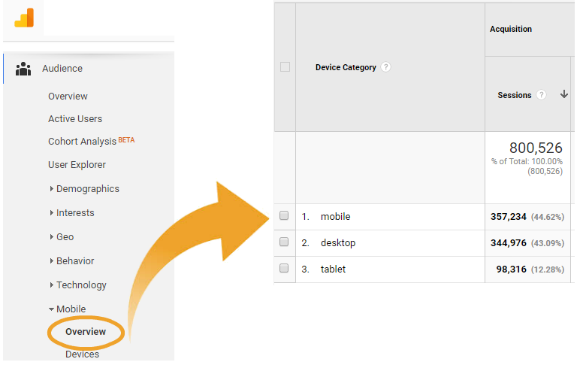
You can tell how people access your website with a glance at your Google Analytics (it’s free software, and we highly recommend you install Google Analytics if you haven’t already). As the image below shows, if you select Mobile > Overview from the Audience menu, you’ll see the exact percentage of site visitors coming to your website on a desktop vs. smartphone vs. tablet.
You might be surprised to see that a large number of people already find you using a mobile device.

Mobile SEO Part 1: Choosing the Right Mobile Configuration
The key to a good mobile user experience lies in choosing the best way to set up your mobile website. Many websites are misconfigured for mobile search or not configured at all, resulting in a huge loss in smartphone traffic.
Mobile search rankings won’t vary much based on which mobile configuration you choose to implement, as long as you offer a good experience and similar content on all devices. The biggest impact will be on user experience and site maintenance. You have three sitewide setup options:
- Responsive design serves up the same content and URLs across all devices, but alters the layout and formatting to fit the user’s window size (accomplished with CSS). This is Google’s preferred mobile configuration. It takes less work to maintain a responsive site since there’s only one version of the content to update. One possible downside for UX and SEO — page load speed may be slower with a responsive design than with the other mobile configurations. Care must be taken to preserve fast-loading pages (see Part 2 for more on safeguarding speed).
TIP: To implement a responsive design, you need HTML templates that can resize automatically based on the user’s device using CSS rules. If your website is on WordPress, this can be as simple as buying and installing a mobile-ready, responsive theme.
- Dynamic serving uses the same page URLs but different content depending on what device is being used to access your website. This dynamic solution works well if mobile users and desktop users have different motives, or if you want to serve content like videos, ads, and other large files to desktop users but don’t want to bog down your mobile experience.
TIP: Dynamic serving requires the use of an HTTP “vary response” header so search engines don’t think you’re trying to hide content (see technical SEO tips for more on avoiding cloaking and other red flags).
- A separate mobile site requires maintaining two separate websites with different URLs and different HTML content on each. This configuration can be best if mobile users have very different needs than desktop users, but site maintenance involves twice the work. You also run the risk of creating duplicate content for search engines if you aren’t careful (see Part 2 for more on this).
TIP: Because of Google’s mobile-first index, make sure a separate m-dot site has enough content and features (such as schema markup, content, etc.) to rank well on its own.
The 3 options for a website’s mobile configuration (image credit: Google Developers Help)

Read more: A Cheat Sheet for Mobile Design explains pros and cons of each of these mobile configurations, while 8 Common Mobile Website Pitfalls to Avoid for SEO helps ensure proper implementation from the get-go if you choose the separate-mobile-site option. Google also offers help for implementing the three different options here: Mobile SEO Overview.
Part 2: Must-Dos
There are a few things you MUST do no matter which configuration you use. This section explains four technical tasks to put on your mobile SEO checklist …
1. Be mobile-friendly.
The basic prerequisite for earning a mobile-friendly SEO boost is passing Google’s Mobile-Friendly Test. Since that’s determined on a page-by-page basis, check each of your important pages. The results will list issues you might need to fix or give you the “mobile-friendly” green light:

2. Tell search engines which page is formatted for mobile.
Search engines look for cues in your HTML code that are different for each type of mobile configuration.
- Responsive sites should put the following meta tag in the head of each web document to signal that the page will adapt to all devices:
<meta name=”viewport” content=”width=device-width, initial-scale=1.0″> - Dynamically served sites need to use the Vary HTTP header in their response to each request. (For more information, see Google’s Help on setting up dynamic serving.)
- Separate mobile and desktop sites need to include <link> tags with rel=”canonical” and rel=”alternate” elements to show the corresponding URL for each page. (For more, see Google’s Help on annotating desktop and mobile URLs.)
3. Keep all page assets crawlable.
As a rule, you shouldn’t block search engines from seeing your CSS files, image files, JavaScript files, and any other resources needed to render the page. They want to see the page as it appears to users. So permit all search engine user-agents — Googlebot, Bingbot and all their cronies — to crawl page resources freely. (Tip: See Step 16 for how to use robots.txt appropriately.)
You can double-check that everything can be crawled using Google’s Fetch and Render tool inside of Search Console.
4. Design for a good user experience on small devices.
Mobile visitors are limited by their device’s small screen size and reduced bandwidth. Keep reading for common mistakes to avoid and best practices for satisfying their needs so they’ll have a good experience on your site.
Part 3: Mobile UX Optimization – Making Users Happy

Photo by Nathan (CC BY-SA 2.0)
When it comes to your mobile SEO strategy, user experience (UX) is the single most important factor for success. Welcome visitors with a fast-loading site and good mobile design. These things impact your site’s rankings, since search engines want to give their searchers a satisfying experience.
Follow these tips for optimizing your mobile user experience to welcome potentially high-converting mobile visitors to your website.
Optimize your mobile site for faster page-loading times.
As we discussed in Step 16 of this SEO tutorial, slow page-load speed can have a negative impact on your rankings. On a mobile device, a slow site feels even slower! This kind of poor user experience can kill your chances for mobile traffic and conversions. Google knows this, which is why they offer a mobile and a desktop version of their PageSpeed tool.
What’s the biggest culprit of a slow mobile site?
Images. Optimizing those fat images for mobile SEO is the No. 1 thing you can do to improve mobile UX. The larger your image file sizes, the longer it will take your web pages to load, especially on a phone or other mobile device. Ways to keep your image files small include compressing your images, resizing images to make them smaller, and specifying the width and height dimensions in your HTML image tags.
Videos can also cause your web pages to take too long to load. Consider embedding smaller or lower quality videos to reduce the amount of data required, as long as it doesn’t impact the viewing experience too much on faster devices. Another option for downloads of videos and other large files is to offer several download sizes. Then users can choose which one best fits their current bandwidth and device. Always look for ways to satisfy your various users’ needs and give each visitor a good experience on your site.
Consider using AMP or PWAs.
Another speed solution is AMP (Accelerated Mobile Pages), a Google-led open-source project for making the mobile web faster. AMP is not for every site, as on-page functionality is limited. But AMP results do load nearly instantly for mobile searchers and get special treatment (not rankings, though) in Google results. (Read more about AMP.)
PWAs (progressive web apps) offer another technical solution for fast mobile pages. Just starting to make waves in the digital marketing industry, using PWAs lets you program one website/app hybrid that works on all screen sizes. (Read more about PWAs.)
Keep your mobile site simple and easy to navigate.
Have you ever visited a website from your smartphone that made you zoom and reposition the screen just so you could see it? A poor user experience like this causes most people to leave the site and find another with a more optimal mobile user experience.
When it comes to mobile search, less is more. Make every word count with valuable content that is:
- Written with the mobile user’s perspective in mind.
- Easy to access with large tap targets and clear navigation options.
- Readable with large enough text in a font that’s legible on a small screen.
- All in all, mobile-friendly. (Tip: Remember to check your important pages in Google’s free Mobile-Friendly Test tool to see if they pass.)

Tailor your content to fit the needs of your audience.
Keep in mind that a mobile user’s search intentions probably vary from that of a desktop user conducting a similar search.
A mobile user searching for Chinese food may be looking for a phone number to order takeout. A desktop user searching for the same thing may be looking for an online ordering option for delivery.
Design your content to give users what they need.
For instance, in our responsive design for bruceclay/jp.com (pictured), the navigation menu stays tucked neatly out of the way. But mobile users can access it as needed with the easy-to-tap menu button. We also added a prominent toll-free number, since we figured if someone is using a mobile phone to check out our various digital marketing services, they’ll probably want to talk to us about their needs.
TIP: Make sure you include enough content on your mobile site to support your long-tail rankings, due to Google’s mobile-first index. Also include markup there to qualify for featured snippets and other search results page enhancements. (See our Schema Markup Guide for more details.)
SEO TUTORIAL BONUS
This video answers common webmaster questions about mobile-SEO best practices for tap targets, margins and font sizes.
Google gives specific, technical advice here on how to create mobile pages that focus on the user.
Finally, be sure to monitor how well your mobile SEO is performing. Many sites look at data for the whole website only, without realizing the story may be completely different for mobile vs. tablet vs. desktop users. Don’t miss out on opportunities to “tweak” your mobile SEO for a more mobile-friendly user experience and a better conversion rate.
Speaking of monitoring — it’s time to show you the ongoing tasks every SEO needs to know. Next in the tutorial, you’ll learn how to monitor your website rankings and other key performance indicators (KPIs) to track your SEO progress over time.


